by: Sam Shepherd, Portfolio Analyst
In a recent research note, we discussed the rapid recovery of the US stock market from its bear market earlier this year. We discussed other periods of 30% declines and the subsequent recoveries to explain where we may be going from here. As long-term investors, we often discuss the upward trend of the stock market over very long time-horizons. The market has moved in cycles throughout history, but the upward trend has rewarded investors who take the long view.
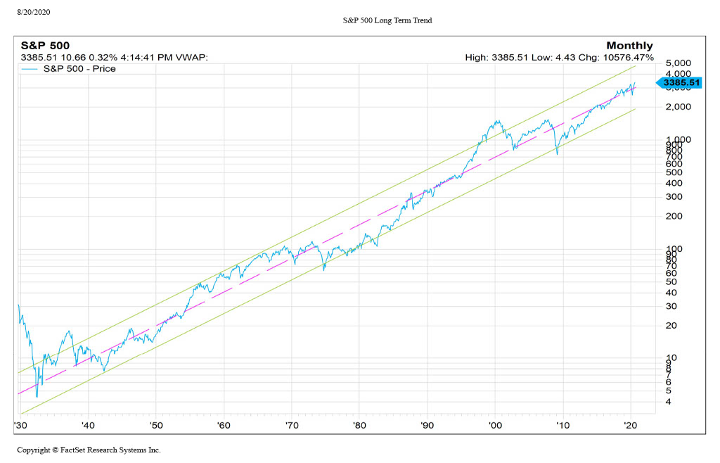
What do these cycles look like throughout history, and what might they tell us about our current period? To illustrate these long-term market cycles, we created a long-term chart of the S&P 500 going back to 1930. Within this chart, we overlaid long-term trend lines representing the average trend of the market over the long-term (pink), and the more extreme upper and lower bounds of that trend. The slope of these lines represents the market’s long-term annualized growth rates during the period, which comes out to about 7.36%.
The chart does a great job of illustrating the long-term cycles of the market. As we have discussed in previous articles, everything is cyclical; extreme corrections generally follow periods of excess, and those downturns will serve as a foundation for new growth and expansion.
You will see that the tests of the bottom trend-line align with some of the most severe moments of the last century: WWII, the inflation crisis of the 1970s, and the Great Financial Crisis. Conversely, periods of great recovery or excess breach the upper bound: the US’s industrial boom following WWII and the Tech Bubble of the late 1990s. Transitions between these long-term extremes can take decades and may span multiple business cycles. The market has not tested this upper bound in about 20 years, and we are only slightly above the center trend line since recovering from the most recent downturn (the Great Financial Crisis). When considering this, we may not be at an extreme point in the market’s history from a long-term perspective.
Given the dramatic recovery from the lows in March 2020, especially in the technology sector, many pundits are drawing comparisons between now and the Tech Bubble era. However, from a long-term view, the market levels do not seem to be extreme against long-term trend returns. For perspective, the period from 1995-1999 (where the price dramatically exceeds the upper trend-line), the S&P 500 returned over 20% for five years in a row. This significant sequence of returns was unprecedented and was the only winning streak of that magnitude in the last 100 years. This positive extreme was preceded by the infrequent occurrence of a ten year sideways move in the market. More recently, the previous five years have averaged nowhere near the excesses of the late ’90s. We combine this view with our fundamental and economic research processes to identify apparent differences between the periods and, therefore, the projected future outcomes.
Taking the long-term view provides both perspective and advantage to investors. When faced with uncertainty as we have been in 2020, we can put the current situation in context to other periods of risk and view how the markets responded. As long-term investors of our client’s capital, we seek to implement an investment process that aligns with our client’s time horizon and does not react to short term disruptions.
As always, if you have any questions or comments, please reach out to our team.

