by: Brian Davies, CFA – Chief Investment Officer
With the recent strength in US equity markets, an important question to consider is: how do today’s returns compare to other periods in history? Additionally, as long-term investors of our clients’ capital, a crucial next step in this analysis is to understand how long-term returns (10 to 20 years) compare across history.
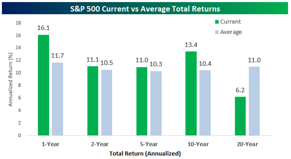
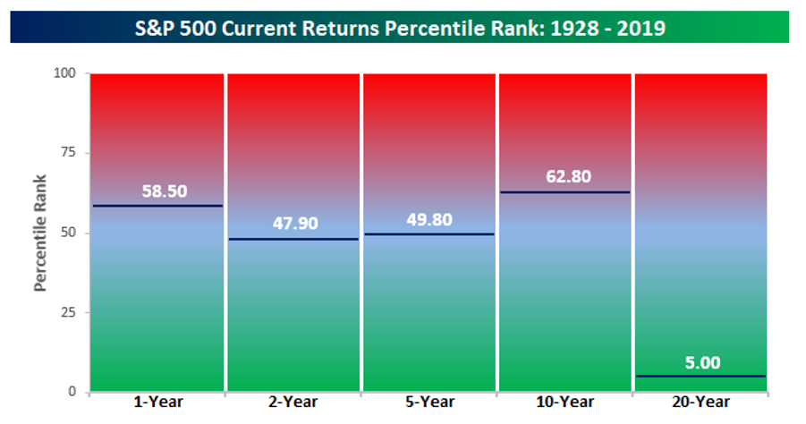
S&P 500 Returns for various periods show a twelve-month stretch that is above average but only just below the 60th percentile of all 1-years returns. The stock market has done well over the last 2,5 and 10 year time periods (see Chart 1) but the returns are not in the top percentiles for those periods throughout history. The number that jumps of the page of these charts is the 20-year time period. The annualized return of 6.2% is way below what 20-year time periods have averaged throughout history (11% since 1928). The past 20-years was essentially one of the worst 20-year periods in history, ranking in the 5th percentile. That’s what happens when the period starts with the excessive valuation levels in 1999 and also includes the debacle of the great financial crisis. If we ran this in 1999 the 1,2,5, & 10 periods were all at peak percentile rankings (deeply in the red in Chart 2). These statistics tend to mean revert when at extremes. This could mean that 10 years from now, the trailing 20-year number will look much better than the extreme low of today.
Chart 1

Chart 2

Disclosures
Content in this material is for general information only and not intended to provide specific advice or recommendations for any individual. All performance referenced is historical and is no guarantee of future results. All indices are unmanaged and may not be invested into directly. The Standard & Poor’s 500 Index is a capitalization-weighted index of 500 stocks designed to measure performance of the broad domestic economy through changes in the aggregate market value of 500 stocks representing all major industries.
